PROFILE TAB REDESIGN
As a UX designer at Futurice, I redesigned the profile tab of a major automotive mobile app, addressing a cluttered, outdated layout with usability issues that frustrated users. Explore how I improved key function visibility and aligned the design with the brand’s evolving strategy.*
The goal of the profile tab redesign was to boost user engagement by making the tab more functional, future-ready—capable of supporting upcoming features—and aligned with the updated branding.
- Needs Identification: Analyzed user and business requirements for the redesign.
- Design Delivery: Created final designs with supporting documentation.
- Accessibility Check: Documented accessible text, reading order, and touchpoint areas.
- Usability Testing Support: Created prototypes and user test scenarios, including research questions.
- Cross-Collaboration: Worked with a team of eight, including UI designers, product owners, and tech teams

Defined project goals and established a roadmap.

Developed conceptual wireframes for the feature vision.

Consolidated ideas into a cohesive design.

Test for usability and gather feedback.

Finalize designs and perform accessibility check.

Finalize documentation and implement updates.
Challenges in the Old Design
The Profile Tab redesign addressed key issues in the old layout. Older research revealed users struggled to find functions like profile theming for personalization, which decreased engagement. The outdated appearance and lack of contextual relevance further compounded these challenges. Some features were removed as they no longer aligned with our business goals.
- Difficulty Finding Key Functions: Users struggled to locate essential settings due to a cluttered layout and inconsistent grouping.
- Outdated Layout and Branding Misalignment: The old design featured a heavy color scheme that clashed with modern branding goals.
- Hidden Theming Options: Hidden theming options decreased user engagement by making customization less intuitive.
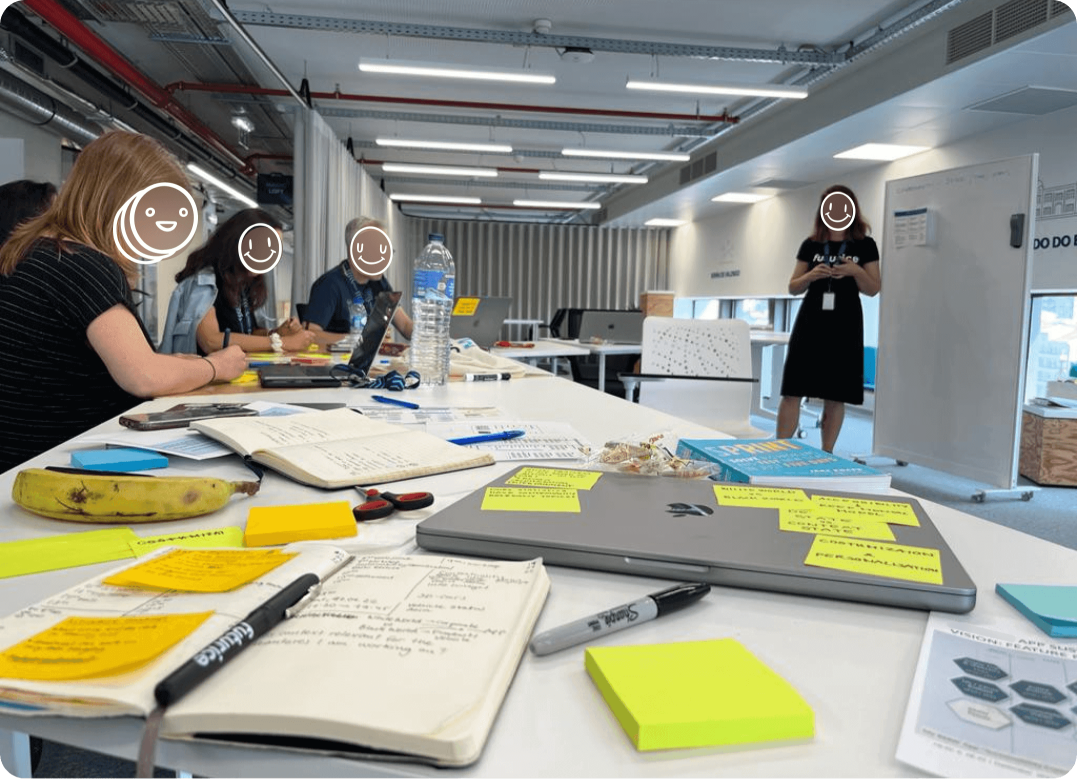
Design Direction and Alignment Workshop
To establish a unified UX/UI roadmap for 2023, the app design team held a workshop focused on planning, identifying dependencies, and aligning on the app’s direction.
- Roadmap Planning: Defined business requirements, identified challenges, and shaped the strategy with design recommendations.
- Interactive Wireframing Session: Using insights from the first phase, participants used paper wireframes to brainstorm and visualize the project's future direction.
Roadmap Planning
Participants were organized by specific tabs or features. I facilitated efforts for the Profile tab, collaborating with UX and UI designers on related features like the Social Profile.
Roadmap Phases
- Q1 (Now): Immediate fixes and essential updates.
- Q2 (Next): Refining features and solving complex challenges.
- Q3 (Future): Adding new features to boost engagement.
- Q4+ (Future +): Focusing on long-term improvements and innovations.
- Incoming Features: Prioritizing features that meet user and business needs.
- Problems to Solve: Resolving key UX challenges.
- Wishlist: UX recommendations for future enhancements.

- Remove misaligned features.

- Enhance ID/Avatar visibility.
- Add Dealer QR Code access.
- Upgrade Settings and Theming.
- Rework Help & Contact area.
- Establish a Data Management section.

- Extend profile header for Social Profile access.
- Add access to Tutorials with onboarding guides for quick reference (UX Wishlist).
Exploring Design Directions
In the pre-design phase, I developed a simplified information architecture to clarify key focus areas and ensure alignment on priorities. This approach facilitated discussions during the workshop, helping maintain focus on improving specific areas and enabling early stakeholder communication.
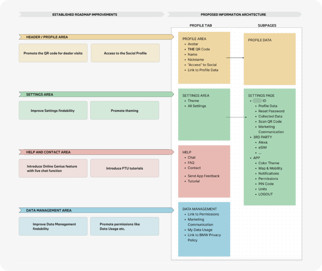
- Profile/ID Area: Enhancing avatar visibility, providing easy access to QR codes, and centralizing social features and badges.
- Settings Area: Improving the findability of settings and offering customizable theming options.
- Help & Contact Area: Integrating live chat and onboarding tutorials for user support.
- Data Management Area: Enhancing visibility and control over user data and permissions.
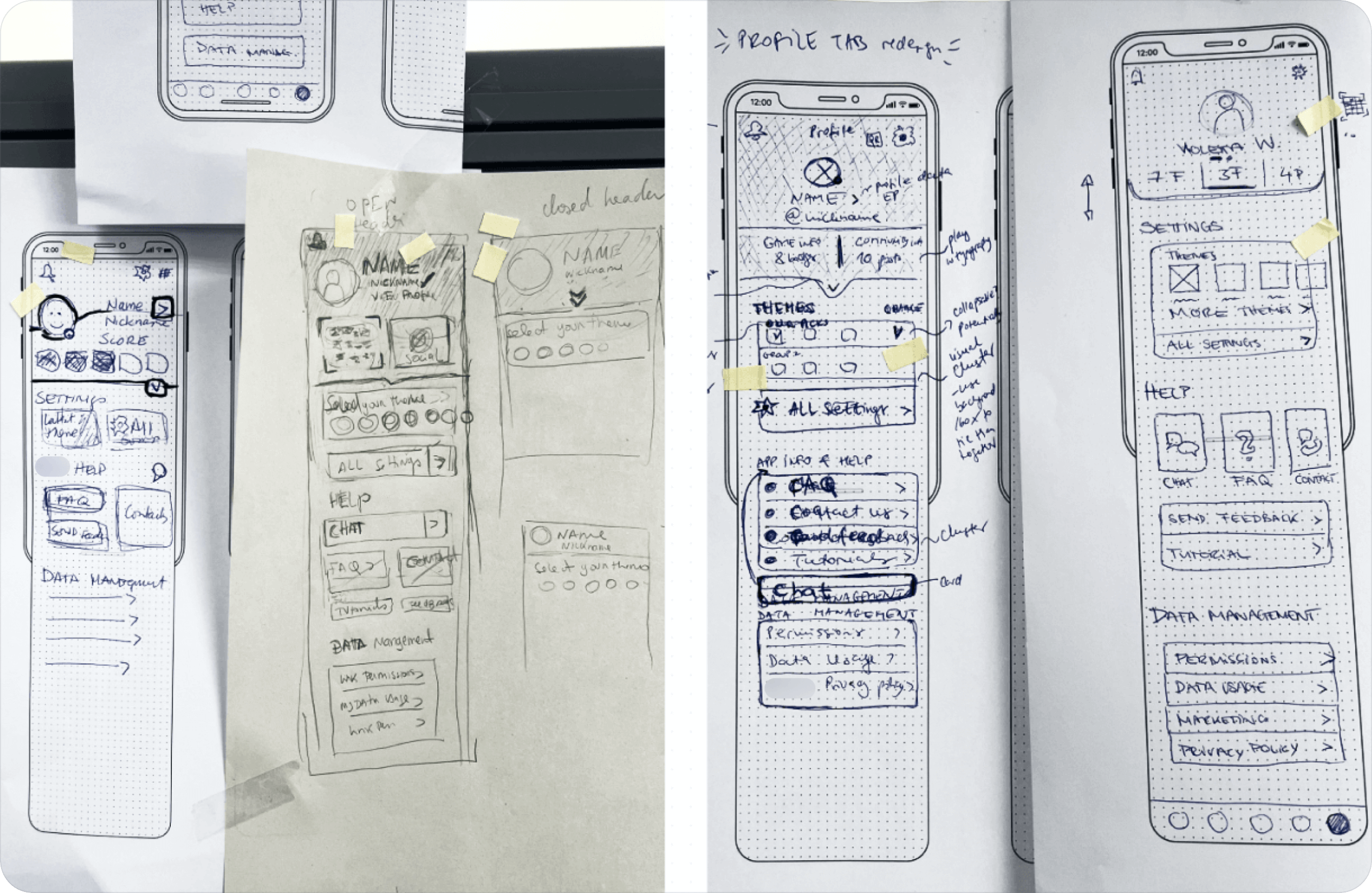
Interactive Wireframing Session
After developing the information architecture, a wireframing session was held to explore and visualize design ideas using paper wireframes. This approach allowed for quick testing of key interactions, layout options, and overall design direction before moving to digital prototypes.
Multiple layouts were sketched, focusing on user profile details, social profile integration with game badges, and core features like settings. A dot-voting system was used to identify the strongest concepts, with participants selecting the most effective wireframes. These top choices directly shaped the next design phase.
User Validation Process
After the design workshops, I got the UX/UI roadmap approved by the tech product owners and translated the strongest paper wireframe concepts into digital designs. I presented three versions to stakeholders, and two were selected for user validation based on technical feasibility to refine them into prototypes.
The Profile tab was tested in three sessions with 8-10 participants each, recruited by an external consultancy. The sessions were streamed live in German and English for immediate feedback. I prepared the research questions and prototypes, which I translated into German.
Testing Focus Areas
- Findability: Assessed how easily users could locate key features like the Dealer QR Code, Settings, and Badges.
- Feature Interaction: Evaluated interactions with features like Social Profile and Theming for intuitiveness.
- Design Consistency: Ensured the profile tab’s design matched the app’s overall visual style.
- Information Architecture Clarity: Analyzed users' understanding of Help, Contact Features, and Data Management presentation.
Profile Tab Refinement Timeline
With consistent focus areas across all three 2023 tests, I'll spotlight key insights from user feedback in the profile tab evolution, leaving out less relevant flow details.

January
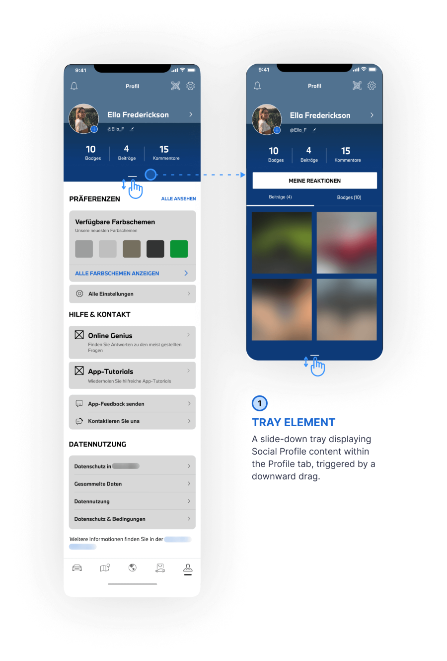
Test two designs for accessing Social Profile information and evaluate the findability of key features like Settings, Dealer QR Code, and Theming.
- Version One: Drag to reveal Social Profile without leaving the tab.
- Version Two: Tap to access Social Profile in a separate tab.
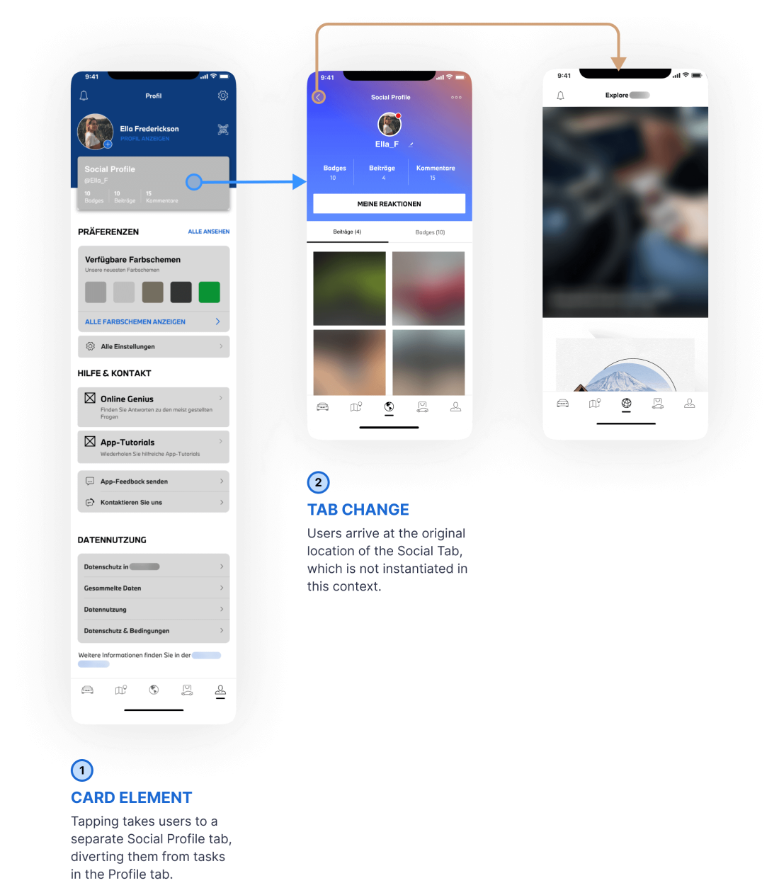
- Intuitive Interaction: Participants preferred the second version for its ease of accessing the Social Profile with a tap.
- Frustrating Tab Switch: The tab change of the second version was seen as disruptive to their workflow.
- Navigation Challenges: In the first version, users had difficulty finding both the QR code and Social Profile.
March
Evaluate the interaction design for accessing Social Profile information within the Profile Tab and findability of other key features.
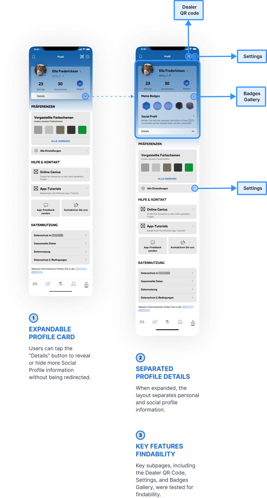
- Tap-to-expand feature for Social Profile details.
- Unified layout separating personal and social profile information.
- Findability of key features, Dealer QR code, Settings, Badges Gallery, as subpages within the Profile Tab.
- Expandable Profile Card Interaction: Participants often misunderstood the badge icon as an interactive element within the status overview.
- QR Code Findability: Difficult to spot, requiring excessive scrolling to locate.
May
The objective of testing was to assess the findability, interaction, understandability and consistency of key Profile tab features.
- Settings and Dealer QR code findability
- Social Profile overview and Theming widget interactions
- Help, Contact, and Data Management clarity
- Effectiveness of new icons for Help and Contact
- Social Profile Overview Interaction: Participants liked that the overview expands for easy access to more details.
- QR Code Placement: Improved placement enhances user ease.
- Theming Option Feedback: Users enjoyed the theming option but desired immediate visual feedback on changes.
Usability Improvements Overview
By the end of this phase, user validation confirmed the design was ready for production. I collaborated with stakeholders through usability tests, presenting refined concepts at key milestones.
Their feedback ensured alignment with business goals while respecting user needs. After three rounds of feedback, the following improvements were made:
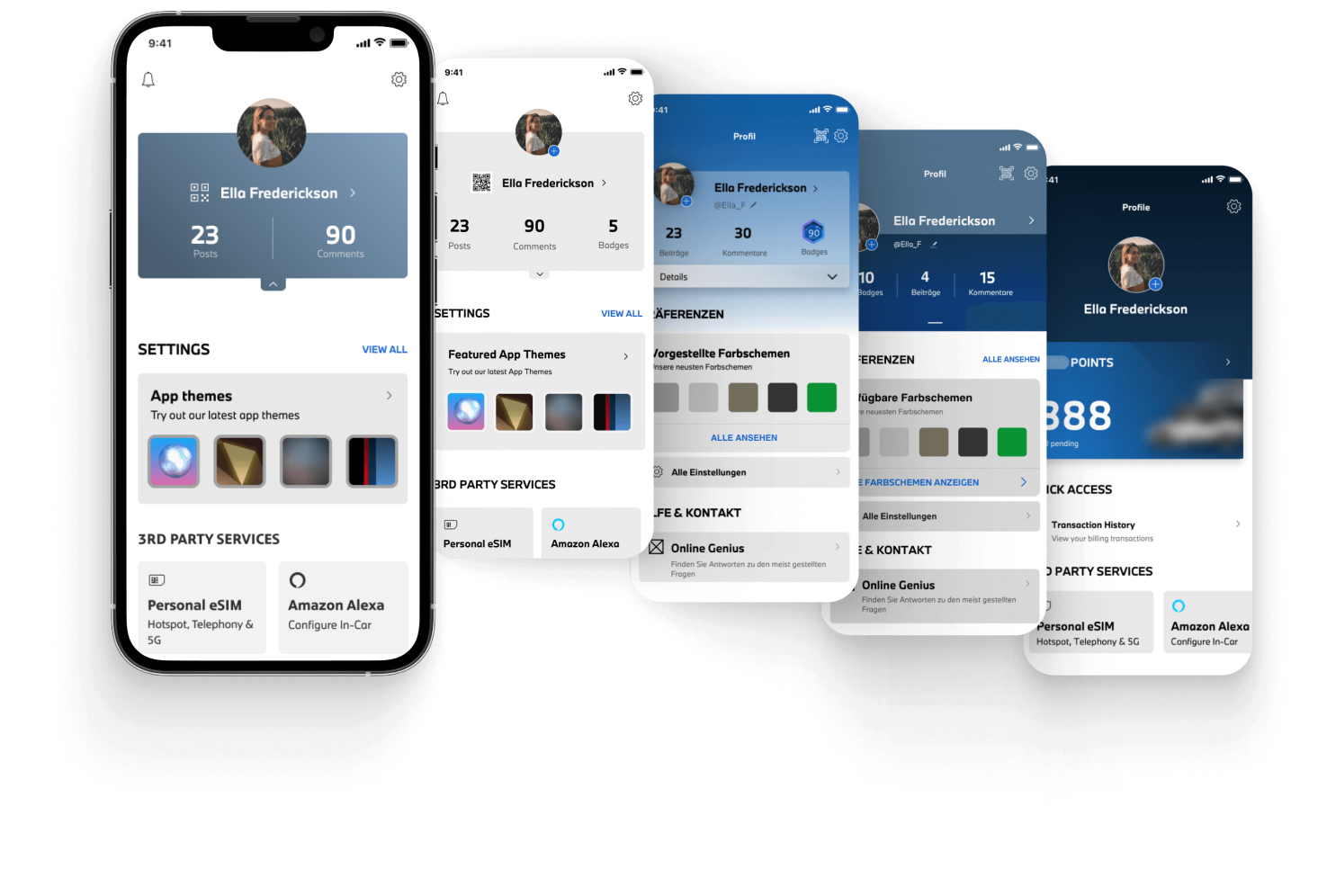
- Action Taken: Frequently used options like theming were duplicated and repositioned from Settings to the Profile tab.
- Result: Enhanced findability and alignment with the app’s strategy.
- Action Taken: Implemented an intuitive tap interaction for the collapsible section in the Social Profile status overview.
- Result: Centralized access to social features enhances navigation and user engagement.
- Action Taken: Added theming options directly in the Profile tab.
- Result: Users can personalize their experience without leaving the page.
- Action Taken: Relocated the QR code closer to the profile image and separated it from the Settings icon.
- Result: Improved visibility makes check-ins quicker and more intuitive.
- Action Taken: Refined the layout for Help & Contact and Data Management features.
- Result: Easier access to these features enhances information management.
- Action Taken: Excluded new illustrative icons for Help and Contact to maintain design consistency.
- Result: This ensures a cohesive look and feel, enhancing overall user experience.
UI Collaboration
During the Profile Tab redesign, I worked with a UI designer to achieve visual cohesion within the app’s design system, resulting in a layout that balances functionality and aesthetics.
Key updates included visually emphasizing interactive features like Theming and centralizing Social Profile info to enhance user engagement and customization, along with minor updates for icon consistency.
UI adaptations were made for light and dark modes across two brands. Due to NDA implications, I can't share specifics about the UI process or the other brand, but each maintains its unique color scheme and typography while using my UX foundations to ensure consistent functionality and a uniform user experience.
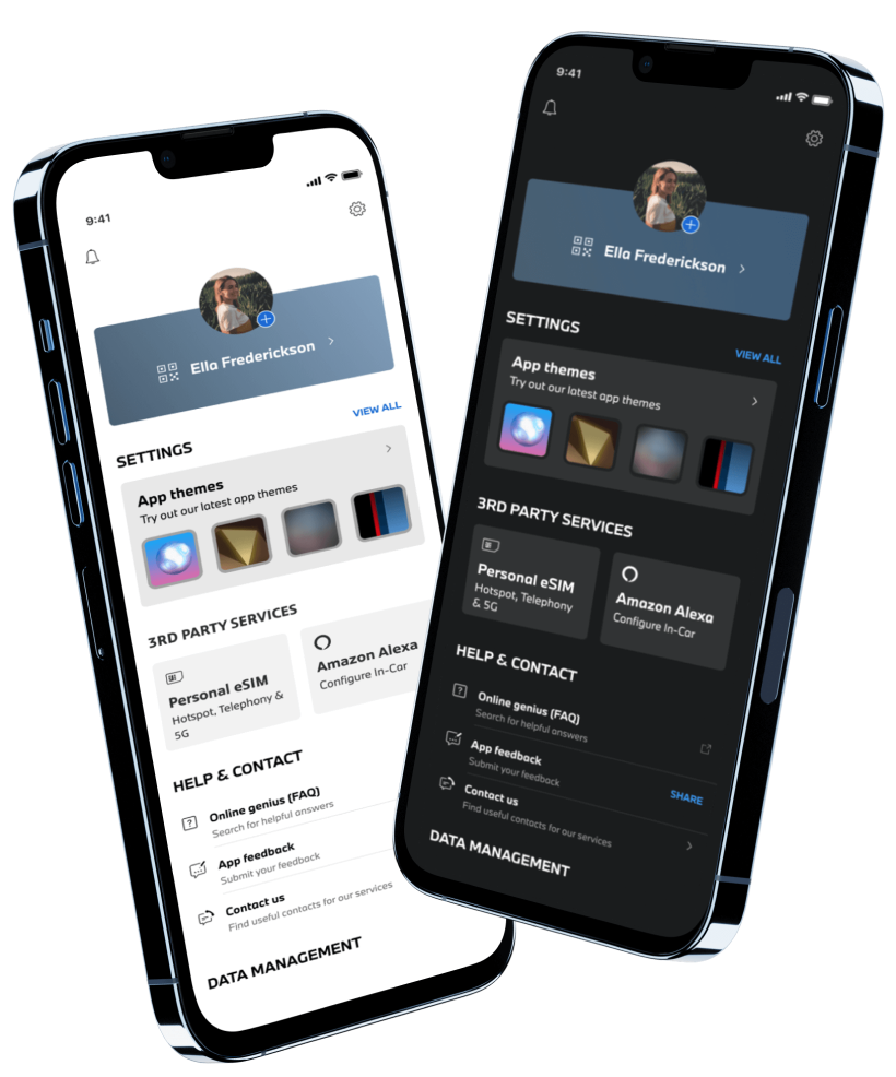
Profile Tab – 2023 Release
The final release in September 2023 prioritized core Q3 features to meet immediate user needs while preparing for future enhancements in 2024 (Q4+):
- Dealer QR Code Introduction: Added for dealer check-ins, streamlining service center visits.
- Personalization hub: Improved settings visibility with easier access to theming options.
- Enhanced Data Management: Improved visibility, giving users greater control over their data.
- Legacy Features: Third-party integrations like eSIM and Alexa retained.
Profile Tab Vision
- Social Profile Section: Centralized social features to boost community engagement (gamified elements like Badges have been postponed).
- App Tutorials Hub: Users can revisit tutorials and onboarding guides anytime for easy feature reference.
Accessibility was a core requirement, ensuring effective navigation for all users. I conducted an accessibility check with documentation, to implement accessible text, optimized touch points, and other checklist items establishing a foundation for accessibility in current and future versions.
Key Challenges and Approaches
Cross-Team Collaboration and Documentation
Challenge
Misalignment's arose due to a lack of processes for checking updated design documentation on Confluence during the Figma transition. This shift created unclear responsibilities, leading the dev team to rely on direct communication instead of official documentation, resulting in implementation inconsistencies.
Approach
I identified outdated wireframes being used, which caused inconsistencies in the final copy and theming modal behavior. After reporting these issues, they were resolved quickly. To address recurring challenges, improving collaboration and documentation practices were prioritized for the next client workshop to establish clearer Figma workflows.
Capacity Constraints and Prioritization
Challenge
Despite an established roadmap, the tech product owners indicated insufficient capacity to implement all planned improvements for the September 2023 release. This led to delays and deferred enhancements, even with the design work completed.
Approach
I initiated discussions with stakeholders to prioritize impactful features, reallocating resources to address delays and ensure essential improvements were delivered on time.
What Did I Take Away?

Refine workflows to enhance role clarity and team alignment.

Engage key stakeholders early to set priorities and manage expectations.

Test designs regularly to validate and refine based on user needs.
First Month Results

Positive engagement metrics confirmed the enhancements' impact, while iterative testing and stakeholder alignment reinforced design success. Regular feedback refined the design to meet user needs and uphold the UX vision. This project emphasized the need for better communication and workflows, which I’ll apply to future challenges.